
In a previous article, we talked about why most organizations should use both SQL Server and Excel for their data management needs. In this article, we’re going to look at an example of how to perform data analysis using SQL and Excel with an Excel Add-In, called SQL Spreads. You can use the Add-In to import data into Excel to create your dashboards.
Data Analysis Using SQL and Excel: An Overview
In a previous article, SQL and Excel: Why you need both, we showed that for many businesses the use of both SQL Server and Excel is an optimum approach to data management. In today’s world, there is more data than ever, and everybody in the workplace needs to be comfortable using data in some way. Excel is the data tool of choice for the vast majority of people, but as we highlighted in the previous article, it has some shortcomings. This is where SQL steps in, and why you need to use both.
Organizations that use SQL have dedicated people or teams to manage their SQL estates. These Database Administrators (DBAs) or other professionals are experts in their field, so why should you need to learn how to use SQL? The answer, is of course, that you don’t have to learn SQL to use data from a SQL database, but there are some real advantages of learning some SQL for Excel users:
- it makes it easier to talk ‘data’ to your DBA team;
- it will help you understand the importance of data structure, and may improve the way you use Excel;
- you can start using SQL query tools (like SQL Server Management Studio) to view and query data yourself, instead of asking a DBA to do it for you;
- learning a new skill can be a fun and rewarding exercise.
Finally, it’s worth pointing out that as an Excel user, you are already familiar with many of the key concepts in SQL. It’s therefore just a case of learning some new terminology. In our Introduction to SQL for Excel Users, we gave an overview of SQL Server and went through the basics of constructing SQL queries.
So, now that you have some basic SQL skills and tons of data, how do you go about analyzing it? In this article, we’re going to run through a use case of querying data in SQL Server and analyzing it using some simple features and functions in Excel, as well as the SQL Spreads Add-In for Excel.
Step-by-Step Example
Use Case
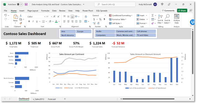
In this example, we’re going to query a database in SQL that holds sales data for an organization and import the results into Excel. Once the data is in Excel, we’re going to create some reports and a simple dashboard view to provide some useful information about the business.
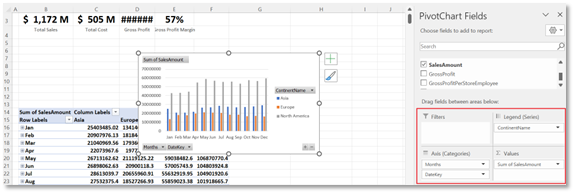
Here is the dashboard we’ll be creating:
Pre-requisites
For this example, we’re going to use SQL Server Management Studio (SSMS), Excel and the SQL Spreads Add-In for Excel. To get started, complete the following tasks:
- Download the free 14-day trial of SQL Spreads
- Download and install SSMS
- Download the sample database (Contoso Sales)
Step 1: Get the data from SQL Server with View
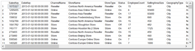
The Contoso Sales database contains a number of tables. The main one which we’re interested in is the Sales table. However, to make it easier to analyze the data and slice by the main dimensions, we need to join the Sales table to several others and create some computed columns. We are also going to create a new View in the database for the data we need.
The script below shows how to create the view that we need in SSMS:
CREATE VIEW [dbo].[v_Sales2013] AS
SELECT
Sal.SalesKey,
Sal.DateKey,
Cha.ChannelName,
Sto.StoreName,
Sto.StoreType,
Sto.Status,
Sto.EmployeeCount,
Sto.SellingAreaSize,
Geo.GeographyType,
Geo.ContinentName,
Geo.RegionCountryName,
Prm.PromotionName,
Prm.PromotionLabel,
Prd.ProductDescription,
Prd.Manufacturer,
Prd.BrandName,
Prd.ClassName,
Cat.ProductCategory,
Sub.ProductSubcategory,
Sal.SalesQuantity,
Sal.ReturnQuantity,
Sal.ReturnAmount,
Sal.DiscountQuantity,
Sal.DiscountAmount,
Sal.TotalCost,
Sal.SalesAmount,
(Sal.SalesAmount - Sal.TotalCost) AS 'GrossProfit',
(Sal.SalesAmount - Sal.TotalCost)/Sto.EmployeeCount AS 'GrossProfitPerStoreEmployee',
(Sal.SalesAmount - Sal.TotalCost)/Sto.SellingAreaSize AS 'GrossProfitPerSqFt'
FROM [Sales] Sal
JOIN [Channel] Cha on Sal.ChannelKey = Cha.Channel
JOIN [Stores] Sto on Sal.StoreKey = Sto.StoreKey
JOIN [Geography] Geo on Sto.GeographyKey = Geo.GeographyKey
JOIN [Promotion] Prm on Sal.PromotionKey = Prm.PromotionKey
JOIN [Product] Prd on Sal.ProductKey = Prd.ProductKey
JOIN [ProductSubCategory] Sub on Prd.ProductSubcategoryKey = Sub.ProductSubcategoryKey
JOIN [ProductCategory] Cat on Cat.ProductCategoryKey = Sub.ProductCategoryKey
WHERE DateKey > '2013-01-01 00:00:00.000' AND DateKey < '2014-01-01 00:00:00.000'
ORDER BY Sal.DateKey asc offset 0 rows
Once you’ve run this script, you can check to see that the data is all there by running a select query in SSMS:
Step 2: Import the data into Excel using an Add-In
We’re going to use the SQL Spreads Add-In for Excel to import the data from the newly created SQL view to Excel. You could also look at importing your data using Excel’s native ‘Get Data’ feature which works pretty well. But, we decided to use SQL Spreads as it has the ability to write-back to SQL Server, unlike the ‘Get Data’ feature. We will discuss later on in the article, how having the ability to write-back to SQL Server helps to enhance your data in your database and in turn, your data analysis. If you haven’t already installed the Add-In, follow these steps to download and install SQL Spreads.
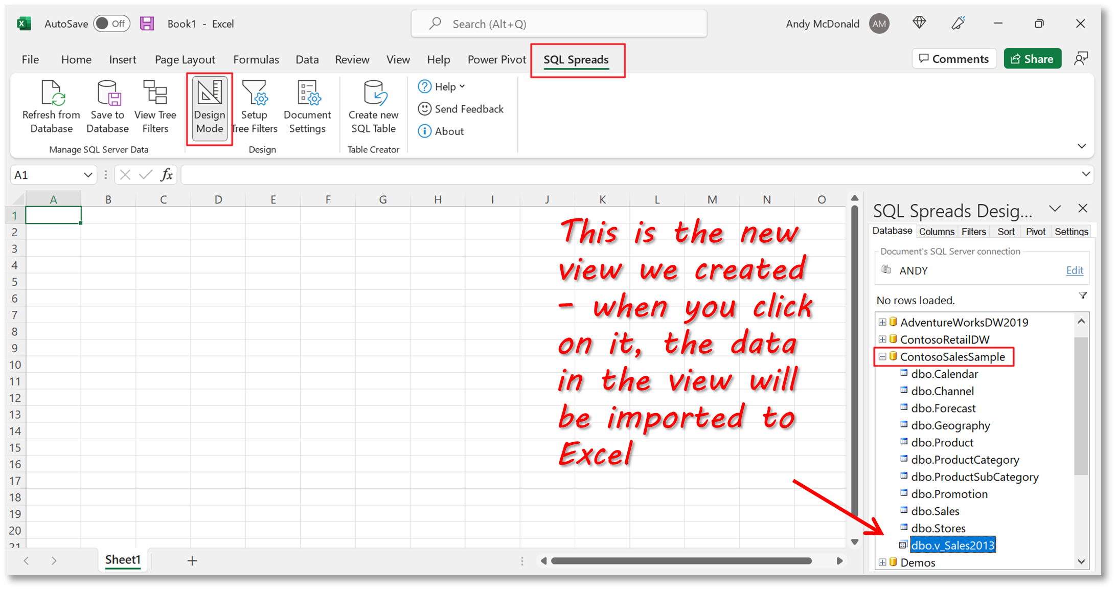
Once the Add-In has been installed, you’ll see SQL Spreads in the tab menu.
Importing the data into Excel is a simple process:
- Click on the SQL Spreads tab menu
- Click on Design Mode, and in the SQL Spreads Designer pane, click on Edit and then enter your connection details
- Once the connection has been created, the list of databases on your SQL Server will be displayed in the SQL Spreads Designer pane, and you can select a database, and then choose the table or view that you wish to import. In our example, it is the v_Sales2013 view in the ContosoSalesExample database.
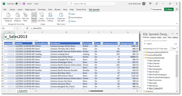
The data in the SQL view will be displayed in a table in the current sheet.
Step 3: Create Visualizations – Summary Value, Pivot Chart and Slicer Examples
Now that we have the data in Excel, we can make use of the analytical tools available in Excel. In this example, we’re primarily going to focus on using pivot tables and charts to gain insights from our sales data.
The dashboard we’re going to create includes 4 charts and a set of summary values (note that in a previous article, Creating Reports with Power BI, SQL and Excel, we created a very similar dashboard using Power BI).
Create basic summary values
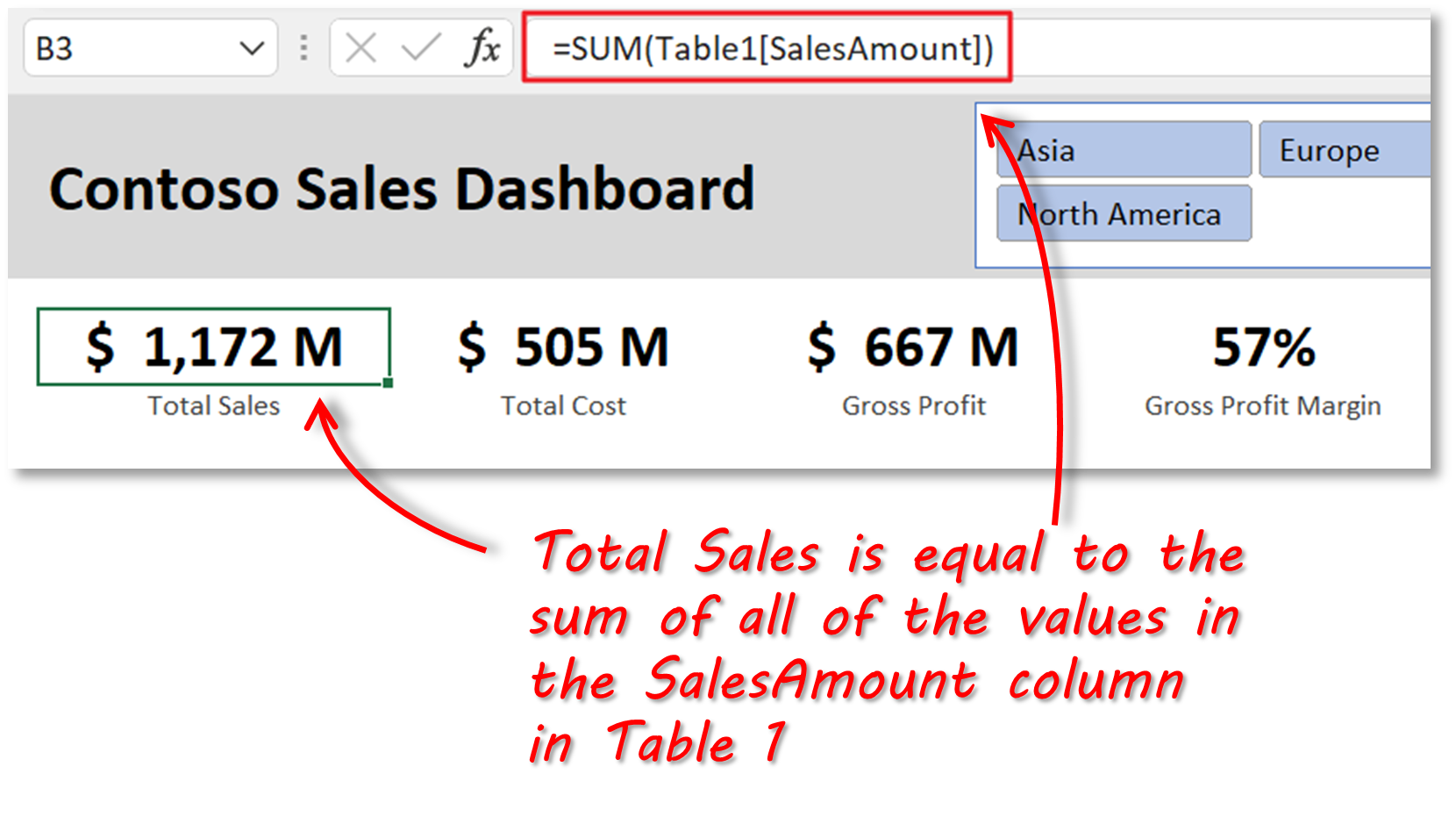
First, we’re going to create the basic summary values at the top of our dashboard. These values display totals for sales, costs, and profit and will be added to a new sheet called “Dashboard”.
The Total Sales, Total Cost, and Gross Profit figure simply use a SUM formula on the relevant columns in Table 1, which is the table that was created by SQL Spreads when the data import from SQL was done. Gross Profit Margin is calculated as Gross Profit over Total Sales.
Create pivot charts
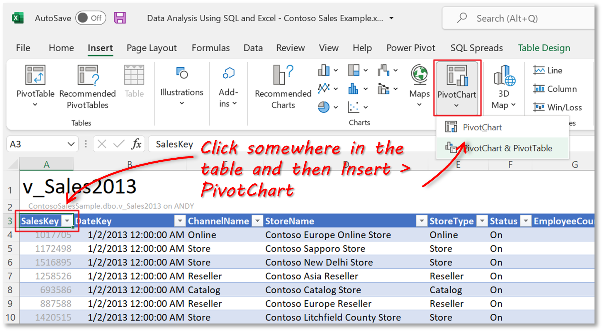
Each of the charts in the dashboard is actually a pivot chart(a pivot chart is the visual representation of a pivot table), as they are quick and easy to use.
To add a pivot chart, click anywhere in the table that contains the sales data and then Insert > Pivot Chart > Pivot Chart.
In the dialog, leave the ‘Select a table or range’ choice as the default of ‘Table1’. For the ‘Choose where you want the PivotChart to be placed’ option, select “Existing Worksheet” and then use the arrow button on the right to navigate to the Dashboard sheet and then select somewhere in the sheet. Don’t worry too much about the exact location now, as we can move things around later.
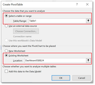
Click ‘Ok’. A blank pivot chart is now added to the Dashboard sheet and we can select the fields to add to the chart.
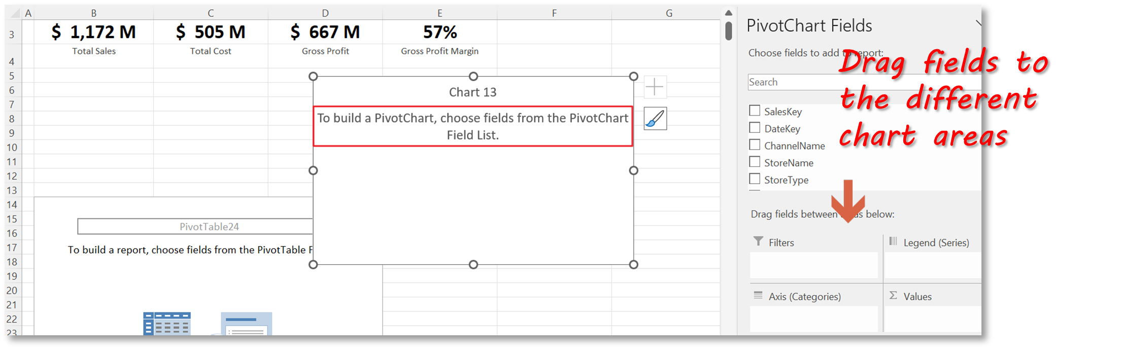
For this chart, which is the Sales Amount total by month, we’re going to add the following fields:
- Values: SalesAmount field – note that because we are adding this field to the Values aggregate, Excel defaults to applying a sum aggregate, but this can be changed if needed
- Axis (categories): Datekey – note that Excel is clever enough to see that we are using date values and will probably want to group them into months, so its created a Month object in the Axis area
- Legend (series): ContinentName – this will show data series for each continent in our data
We now need to do the following to format and clean up our chart:
- Change the type to Line – select the chart, then click on Design > Change Chart Type > Line
- Remove the field buttons on the chart, as we’re going to use slicers instead to filter the data in the chart – select one of the field buttons, right-click and then click ‘Hide all field buttons on chart’
- Move the legend to the bottom of the chart – select the legend, right-click and then select ‘Format Legend’ and choose Bottom as the position
- Move the pivot table that accompanies the pivot chart out of sight – select the whole pivot table and then drag it further down the spreadsheet so that it’s out of sight of the dashboard area.
The same procedure can be used to create the other 3 charts.
Create slicers
Slicers provide buttons that you can click to filter tables, or pivot tables/charts. In addition to quick filtering, slicers also indicate the current filtering state, which makes it easy to understand what exactly is currently displayed.
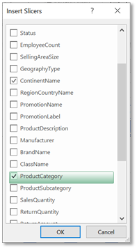
In our example, we’re going to add 2 slicers, one to allow us to filter by Continent, and one to filter by Product Category.
To add a slicer, select one of the pivot charts and then click on PivotChart Analyze > Insert Slicer. A dialog is displayed that lists all of the fields that can be used to filter the data. We need to select Continent and ProductCategory. We now have 2 slicers for our dashboard.
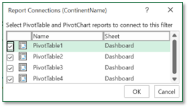
By default, the slicers that we created are only connected to the chart that we used to initially create them. To also connect each slicer to the other pivot charts, select a slicer, right-click and then click on ‘Report Connections’ and check the other 3 pivot tables.
Format the dashboard
We now have all the elements of our dashboard, so all that is left is to do some formatting and tidying up to get it looking right. This involves the following tasks:
- Prevent the pivot tables from auto-resizing columns – the default behavior of pivot tables is for them to automatically adjust the width of columns as the data is refreshed, but this means that whenever a slicer filter is changed, the columns of our dashboard will change. To disable this, select a pivot table, right-click and de-select the ‘Autofit column widths on update’ option.
- Format the chart axes to display values as millions – select the axis values, right-click and select ‘Format Axis’, then change the Display Units option to millions.
- Align and space charts and slicers – this can be done using the standard Excel alignment tools
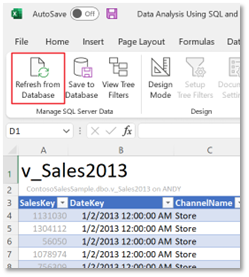
Bonus: Use SQL Spreads to refresh the dashboard and update forecast data
Refresh from Database
The dashboard we’ve created in Excel uses sales data from a SQL database. It is normal for this data to be updated by financial applications. Because we have created a data connection from Excel to SQL Server using the SQL Spreads Add-In, it is easy for us to refresh the data in Excel whenever we need to. This is done using the ‘Refresh from Database’ feature in SQL Spreads.
We have briefly spoken about Excel’s ‘Get Data’ feature earlier in the article. Although you can refresh your dashboard using that feature, it does not have the capability to write-back data to SQL Server. And there are some benefits for anyone analyzing data to write-back to SQL Server. For instance, if you wanted to enhance your database with an additional table or column for more context, then being able to write-back to SQL Server from Excel would be convenient. Read on to see how SQL Spreads achieves this with their write-back capabilities.
Update Forecast Data
In this kind of use case, it is also typical to want to compare actual sales data to forecast data. We can do this by adding an extra table to our SQL database called ‘Forecast’ which contains target sales values for each month.
Typically, the forecast data would be created at the start of the year and updated throughout. We can import the forecast table into Excel using SQL Spreads and then update the data in the SQL table from within Excel.
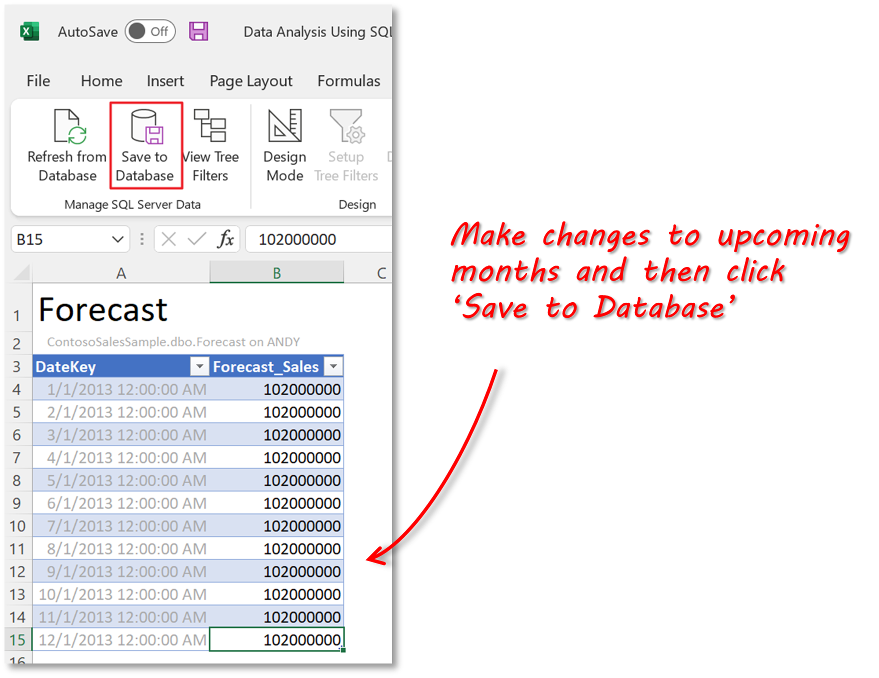
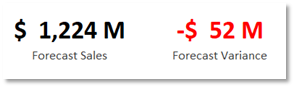
The benefit of being able to enter the forecast data in Excel and have it written back to SQL Server is that we have the data stored where it should be (in SQL) and it can also be used to feed our sales dashboard. Using the data in the imported forecast table, we can add 2 additional summary values to the dashboard:
Now that you have created your dashboard, and learnt how to refresh and update it, you can share it with your sales or management team. An easy way to do this, is to link up your Excel dashboard with PowerPoint using the Power-user add-in. This will save you time with every update, automate entire reports and reduce manual errors you may end up with when trying to get your data manually into a PowerPoint-ready state.
Summary
In this article, we’ve shown how to import data from a database in SQL into Excel and then use analysis tools in Excel to create a dashboard. The dashboard provides insight into the underlying data and provides business users with information to make decisions.
In addition to standard SQL and Excel functionality, the procedure that we showed makes use of the SQL Spreads Add-In for Excel. This simple approach means that you don’t necessarily need to use a tool like Power BI to gain insights into business data.
To see how SQL Spreads can help you easily perform data analysis using SQL and Excel download the free trial today.
Editor’s note: This blog post has been updated for accuracy and comprehensiveness.
FAQs
Can I use SQL with Excel?


Yes, you can use SQL with Excel by importing data from SQL Server databases into Excel. SQL is primarily used for storing, managing, and querying data, while Excel provides a user-friendly platform for data analysis, reporting, and visualization. Tools like the SQL Spreads Add-In make this integration easy, allowing you to easily import SQL Server data into Excel, and then query, analyze, and visualize SQL data within the Excel environment. It also allows you to refresh your dashboard visualizations and write-back any changes to the SQL Server database. This combination boosts Excel’s capabilities for data analysis and reporting. Try the SQL Spreads 14 day trial.
Is SQL and Excel enough for a data analyst?
Yes, SQL and Excel make a great foundation for data analysis. You don’t have to be a data expert, but having skills in both SQL and Excel is very useful for effectively studying and displaying data. As large datasets are a common challenge, combining SQL and Excel offers data analysts an efficient way to gain deeper insights into such datasets. An Excel Add-In, like SQL Spreads, can facilitate working with large datasets by allowing you to select which data to load from SQL Server into Excel using Tree Filters. Download the SQL Spreads Add-In and find out how to setup the Tree Filters.
How do I use SQL with Excel data?
To use SQL with Excel data, you can import data from SQL Server into Excel using tools like Excel’s ‘Get Data’ feature or an Excel Add-In like SQL Spreads. Both have the ability to import data into Excel and refresh the data. After the import, you can use Excel’s standard functionality to analyze data and create dashboards using Pivot Charts, Summary Values and Slicers as an example. SQL Spreads goes a step further and allows you to write-back changes to your SQL Server database which is convenient if you need to add information to the database.


Leave a Reply
No comments yet. Be the first!