Power BI is a Business Intelligence (BI) platform. With Power BI, users can get data, analyze it, and create visualizations that help turn data into actionable information for their business. In this article, we’re going to look at creating Power BI dashboards and reports, and give some examples of how and when to use them.
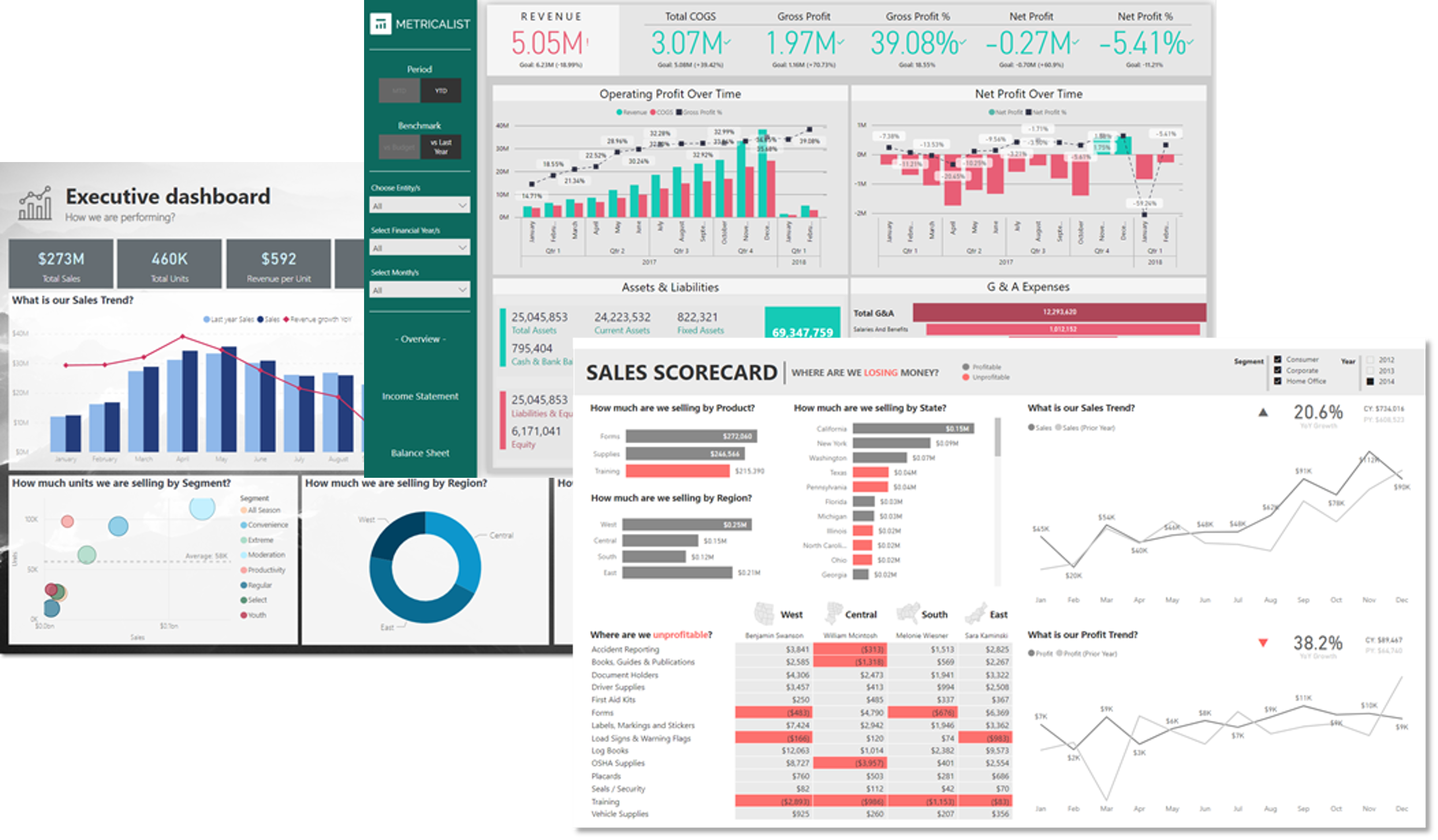
An Introduction to Power BI
What is Power BI?
Power BI is Microsoft’s business intelligence (BI) platform and is built on some solid foundations. It was originally bundled with SQL Server, and portions of it evolved from Excel add-ins such as Power Query, Power Pivot, and Power View. Although it is more of a collection of applications and services, as opposed to a single app, the whole Power BI experience is now well integrated and intuitive to use.
Microsoft is deliberately targeting Power BI at a wider audience than just BI Developers or Data Analysts. Power BI is relatively simple to use and with hooks into everybody’s favorite app, Excel, Microsoft is pitching it as a self-service option for general users to create their own reports and dashboards. If you are a Microsoft shop, Power BI is a no-brainer for your BI needs.
However, not every user can jump in and start creating amazing reports and dashboards from day one. Although the Power BI suite provides great flexibility in terms of how to get data and process it, there are still some defined steps that need to be followed. There are also some tips and tricks to get the most out of your dashboards. We’ll cover both these areas in this article.
What are Power BI Dashboards and Reports?
A dashboard provides a single page at-a-glance view of business metrics and KPIs (Key Performance indicators). It helps answer fundamental questions like “How is my business/department/team/project doing?”. Reports, meanwhile, give more detailed information and allow users to dig a little deeper to identify trends or anomalies, usually through filters.
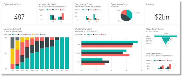
In Power BI, reports and dashboards are two distinct entities that are used together to meet your data visualization needs. The difference between them can be confusing to new Power BI users. They both display visualizations on a canvas, but when should you use reports and when should you use dashboards? There are some key differences in the functionality of each which you need to consider when designing a solution.
| Capability | Power BI Dashboard | Power BI Report |
|---|---|---|
| No. of Pages | One page | One or more pages |
| Data sources | One or more reports and one or more datasets per dashboard. | A single dataset per report |
| Drilling down in visuals | Only if you pin an entire report page to a dashboard. | Yes |
| Created in | Power BI Service | Power BI Desktop |
| Filtering | No. Can’t filter or slice a dashboard. Can filter a dashboard tile in focus mode, but can’t save the filter. | Yes. Many different ways to filter, highlight, and slice. |
| Can see underlying dataset tables and fields | No. Can export data but can’t see tables and fields in the dashboard itself. | Yes |
| Can set alerts | Yes; email when specific criteria met | No |
So, a Power BI dashboard has the following key characteristics:
- It can only have one page
- It can have multiple visualizations from multiple data sources
- There is no filtering or slicing
- It can generate alerts
- It is made from visualizations in Power BI Reports
A Power BI report has the following key characteristics:
- It can have one or many pages
- It can have only one dataset
- It can include filters/slices
Due to some of the limitations of the Power BI dashboard entity (no filtering/slicing is a big one), designers will often build one-page Power BI reports and use these as ‘dashboards’ (to the end-user, there really is no difference). Of course, if multiple datasets need to be referenced, then a dashboard is the best solution.
A good way to think about reports vs dashboards is an organization with multiple departments – each department could have a one-page Power BI report as their ‘dashboard’, whilst the CEO could have a Power BI dashboard that shows a handful of KPIs across all the departments.
One final consideration when choosing between a dashboard and a report is to think about where it will be displayed and whether any interaction is needed. For example, your CEO may want a dashboard showing 5 or 6 important KPIs across the business on a big screen in the office to provide up-to-date feedback on performance and generate motivation. In this case, no interaction is needed, and so a Power BI dashboard would be appropriate.
In the remainder of this article, we’ll use the term ‘dashboard’ to refer to a Power BI dashboard or a one-page Power BI report.
Overview on Creating Power BI Reports and Dashboards
Dashboards are created by designers using the Power BI service (also known as Power BI online). The Power BI service is the SaaS (Software as a Service) part of Power BI. Each of the visualizations that you see on a Power BI dashboard is a tile that is pinned from a Power BI report. To create a dashboard, you therefore need to create the underlying reports in the Power BI Desktop app.
The diagram below shows a typical process for creating Power BI reports and dashboards.
- Get & Transform data. This is where you identify the sources of data for the information you want to display in the report/dashboard. A typical report or dashboard might use data from databases, as well as CSV files and Excel spreadsheets. The process of getting and transforming the data can be done in Excel or Power BI Desktop. You could, for example, import data into Excel from SQL Server, perform some transformations using Power Query, and then import the Excel workbook into Power BI Desktop. Alternatively, you can work in Power BI Desktop and query/import/transform data from there. The end result is the same – you’ll have a Power BI dataset that you can use to create reports and then dashboards.
- Create Reports and Dashboards. A Power BI report provides views into a data model, with visualizations that represent different findings and insights from that data model. Reports normally have a detailed operational focus, whereas dashboards provide a higher level ‘quick glance’ overview of a business area. Reports are created in Power BI Desktop by adding visualizations and filters to the canvas based on the dataset(s) created in the previous step. Once reports have been created, they are published to the Power BI Service where they can be shared with end-users and (optionally) dashboards created from them. Dashboards are simply containers that display highlighted visualizations from a collection of reports.
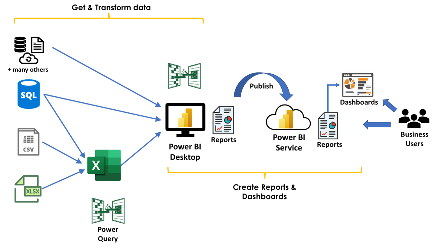
Once you’ve created your reports in Power BI desktop, you save your work as a Power BI file (.pbix) – this contains the underlying data as well as the report structure. You can therefore send this to other users as a complete entity and they can open and work with the report. Later on, when we look at some examples, we’ll refer to PBIX files.
What are the Benefits of Power BI Dashboards
Power BI Dashboards are an effective way to convey important high-level information about an area of your business or organization. They are great at quickly answering critical business questions like “How is our business doing?”; “Are we making our target?”; “In which area(s) are we doing well/badly?”. Dashboards won’t, however, tell help you answer the “whys” behind those questions – for those, you need to drill through to the underlying reports and analyze those.
A good dashboard can therefore provide the following benefits:
- Improved real-time visibility into business performance
- Quicker response times when problems arise
- Greater transparency
- Improved communication across the organization
- Time-savings
- Reduced anxiety
It can be surprisingly difficult to create a good dashboard that realizes all these benefits. In the next section, we’ll look at some tips and best practice guidelines. We’ll then look at some examples and discuss the good and bad points.
Tips and Best Practice Guidelines for Dashboards
The list below provides some good basic advice to help you build better dashboards.
Determine your audience and goals. This is the most important thing to consider. Which group of people is the dashboard aimed at and what are you trying to tell them? For example, a dashboard displaying sales figures could be aimed at the sales team and show them performance by product/geographical area/
For example, a sales team may need a dashboard that answers the question “How well are we doing?”. The dashboard would then need to show sales by category/product/geography in comparison with targets/competitors/previous periods. A finance team, however, would probably want to see the sales figures in relation to costs to see which products or regions are profitable.
Choose relevant metrics and KPIs and provide context. Dashboard real estate is limited, so you should only include information that helps deliver your goal. For example, having a scorecard visualization showing sales total doesn’t necessarily help because the audience doesn’t know if the number is good or bad. By introducing a KPI like ‘YTD sales as a % of Target’, the audience can immediately see if sales are doing well or not.
Consider the layout carefully. Dashboards should be clean and simple and the eye should be able to scan the page intuitively. Top-level metrics and KPIs should be in the upper part of the dashboard, with charts and other visualizations lower down. Labeling and formatting across the layout should be consistent. Filters/slicers should be in the top right corner, or on the left-hand side in a distinct block.
Use simple visualizations. Most dashboard tools offer a large range of visualization types, but it’s best to stick with the simple ones, like line charts, bar/columns charts, cards/KPI’s and simple tables.
Use interactive elements. A good dashboard conveys information clearly to an audience and answers its questions quickly and easily. However, users should be able to interrogate the data further if they need to. Including drill-throughs to detailed tables or charts is a good way to do this, or in some cases animations.
Avoid common visualization mistakes. These can include how numbers are displayed (eg it’s better to show $30k instead of $30,350.50), rounding errors (ie percentages should add up to 100%), too little spacing between visualizations, and trying to fit too much on one page.
Power BI Use Cases with 5 Dashboard Examples
There are numerous use cases for creating dashboards. It’s common to look at functional areas when defining these. The list below shows the more common ones.
- Management: this would be for c-level executives to get an overview of important operational KPIs across the organization, as well as financial overviews and investor summaries
- Finance: this would be for finance directors and their teams to keep an eye on finance KPIs, cash management, sales, costs, and profits
- Sales: this would be for the sales teams to track sales-related KPIs, conversion and opportunity and metrics
- Marketing: this would be for the marketing team to see marketing KPIs and performance measures
- HR: this could include basic metrics about the workforce, as well as KPIs relating to recruiting and talent management
- Service & Support: this would cover the areas of customer service performance and customer retention
- IT: there are various areas this could cover, including IT Project Management, CTO KPIs, IT Issues, IT Cost Management
We’ll take a look at an example in each of the functional areas. These examples are from the Data Stories Gallery in the Microsoft Power BI Community – this is a great place to get inspiration across a wide range of use cases.
Management: Executive Dashboard
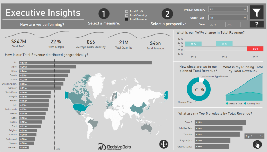
This is a high-level dashboard aimed at senior managers in an organization. More information and the link to view the dashboard is here.
What is good about this dashboard?
This is a good, clean dashboard with a nice layout and some good use of different visualization types.
- Layout: the top-level metrics are across the top, with the filters in the top right corner and the more detailed visualizations in the lower half. This follows the best practice approach.
- Visualizations: the mix of different visualization types makes for an aesthetically pleasing dashboard. The cards, vertical and horizontal bar charts, and map are particularly effective for the data being displayed.
- User Interactions: the data can be selected using the year buttons in the top right-hand corner
- Headings: the headings on each visualization are good because they simply ask the question that the data is intending to answer – this makes it easy for the viewer to know what they looking at and why.
- General comments:
- the values used for the cards have been rounded nicely (instead of putting an exact dollar amount)
- the theme colors are muted, so don’t distract from the actual data
- there is a fair amount of white space on the dashboard so it doesn’t look too cluttered.
What could be improved?
There are several things that would improve the effectiveness of the dashboard.
- Context: it would have been useful to add some context to the top-level metric cards across the top of the dashboard; e.g. is the current Total Revenue above or below the target (or last years’value)?
- Visualizations: the donut chart doesn’t really work too well to answer the question “How close are we to our planned Quantity/Profit/Revenue?” A clustered bar chart or a line/bar chart is normally best for this kind of comparative data.
Finance: Financial Performance Overview
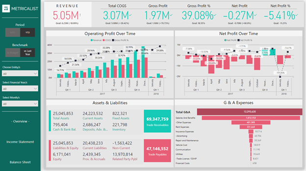
This is a fairly detailed financial performance dashboard aimed at CFOs. In addition to the Overview page, there are also pages for Income Statement and Balance Sheet. More information and the link to view the dashboard is here.
What is good about this dashboard?
This is a good dashboard with a nice layout and some good use of different visualization types. It has more detail and looks less clean overall than the previous example, but for this use case (CFO dashboard) it is probably appropriate.
- Layout: the top-level metrics are across the top, with the filters and navigation to other pages on the left-hand side, and the detailed visualizations in the lower half. This follows the best practice approach.
- Visualizations: the mix of different visualization types makes for an aesthetically pleasing dashboard. The cards and vertical bar charts have been chosen well.
- User Interactions: there are several filters to interact with the data, and these work well. The toggles to switch between MTD and YTD figures and to select the comparison for context (budget or previous year) are very useful.
- Headings: the headings are clear and unambiguous
- General comments:
- the values used for the cards have been rounded nicely (instead of putting an exact dollar amount)
- the grey background makes the data itself stand out well. The conditional formatting of the card metrics is very useful (ie changing from green to red when below target).
- Despite the level of detail on the charts themselves, the dashboard does not appear cluttered because the number of visualizations has been kept to the bare minimum.
What could be improved?
There are only a couple of minor things that could be used to improve the effectiveness of the dashboard.
- Context: although the cards along the top of the dashboard show icons to indicate if the values are above or below target, they are not very visible – simple red/green arrows pointing up or down would be more effective
- Visualizations: the funnel chart doesn’t really make sense for the data here. Funnel charts are better used for displaying data like sales conversions.
IT: Help Desk Report
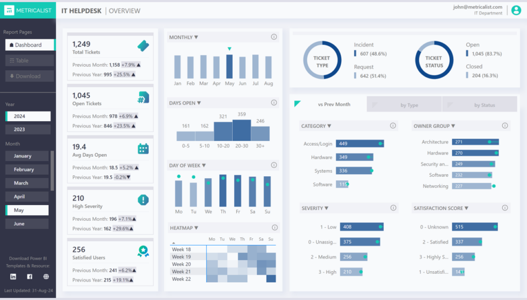
This is a fairly detailed help desk dashboard aimed at operations and support teams. It helps answer the basic questions that an Operations or Support Manager might ask. More information and the link to view the dashboard is here.
What is good about this dashboard?
This is a good, dashboard with a clean, simple layout and some effective use of contextual data to show current values vs previous periods.
- Layout: several KPIs and important metrics are displayed as cards down the left-hand side which works well, as the eye is normally drawn to this side. The rest of the page displays ticket counts across different measures and using different visualizations; some more effectively than others.
- Visualizations: the use of KPI visualizations (a special type of card visualization that incorporates target comparison) is a good choice for the main KPIs/metrics on the left-hand side.
- User Interactions: there are filters on the left-hand side to select dates. Other filters to select by ticket type or status are included alongside the chart visualizations.
- Headings: headings are not used much in this dashboard (other than for each of the main KPI/metric cards) as the data is basically showing counts.
- General comments:
- the muted color palette is effective here as there are quite a few visualizations, and too much color would have made the dashboard look cluttered.
- The choice of visualization types is generally good, for example, the use of a histogram to show counts of tickets grouped by days open. The heat map is also good for this type of data as the user can intuitively see which days are busiest.
What could be improved?
There are only a couple of minor things that could be used to improve the effectiveness of the dashboard.
- Visualizations: it would be useful to use some conditional formatting on the KPI visualizations to highlight when the current value is above or below the previous period.
- Filters: it would have been better to have created a filter to display either Incident or Service tickets as these would have different kinds of focus for the operations teams.
Sales: Sales Performance Overview
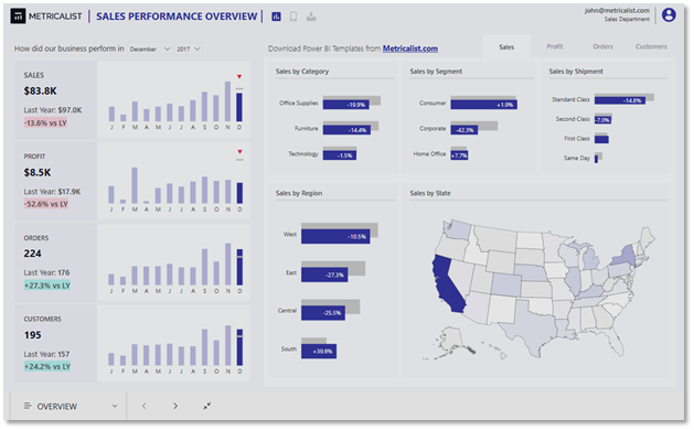
This Sales Performance Report provides an in-depth analysis of sales data, and can be used to identify trends, monitor performance, and make data-driven decisions. It covers several areas, including sales, profit, orders and customers. More information and the link to view the dashboard is here.
What is good about this dashboard?
This is another dashboard with a clean, simple layout and some effective use of contextual data to show current values vs previous periods.
- Layout: the left-hand side shows values for the key areas of sales, profit, orders and customers for the selected month/year. The right-hand side uses tabs for each of the key areas to display values for several dimensions.
- Visualizations: the report uses simple card and bar chart visualizations and a map chart to display the data effectively. Comparisons to previous periods are used extensively to help the viewer evaluate the data that is presented.
- User Interactions: there are filters on the left-hand side to select dates. The viewer can also use the tabbed report feature to switch between the different key areas.
- Headings: headings are kept to the bare minimum in keeping with the style of the report.
- General comments:
- the muted color palette is effective here as there are quite a few visualizations, and too much color would have made the dashboard look cluttered.
- The limited use of different chart types is effective.
What could be improved?
There are only a couple of minor things that could be used to improve the effectiveness of the dashboard.
Targets: in sales dashboards it is often useful to answer the question “are we on target?”. Although this dashboard compares values to previous periods to indicate whether sales are up and down, there are no comparisons with targets.
HR: HR Analytics Dashboard
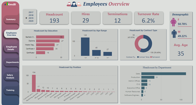
This dashboard provides summary information as well as more in-depth analysis across a number of areas within a Human Resources department. More information and the link to view the dashboard is here.
What is good about this dashboard?
This dashboard packs in a lot of information in a simple, visually appealing way – the use of tabbed sheets to show different levels of detail, as well as different areas is very effective.
- Layout: there are 6 tabbed pages, each focussing on a different level of granularity (overview of detail) or a different aspect of HR. The formatting, visualization styles and design theme is used consistently across each of the tabs, making the report visually appealing.
- Visualizations: the report mostly uses simple card and bar chart visualizations which are effective for this use case. The use of colors is also good and presents the data clearly to the viewer
- User Interactions: the main user interaction is through the use of the tabs on the left-hand side. Additional filters for date and in some cases department are used on the detailed tab views.
- Headings: the headings are clear and unambiguous, although different font styles are used on some of the charts, which looks a bit odd.
- General comments:
- The presentation of a large volume of data in this dashboard without over-whelming the view is impressive.
- The color scheme and limited use of different chart types is very effective.
What could be improved?
There are only a couple of minor things that could be used to improve the effectiveness of the dashboard.
- Filter position: on some of the tabbed sheets the position of the date filter varies – it is best practice to keep user interaction components in the same place across multiple pages.
- Targets / Comparisons: there are no comparisons or targets, so we don’t know, for example, if a staff turnover rate of 6.2% is good or bad.
Summary
In this article, we’ve introduced Power BI, which is Microsoft’s Business Intelligence (BI) platform. The full Power BI solution provides tools to collect, modify and visualize your data, but here we’ve focused on the visualization aspects – specifically Power BI dashboards.
One of the main takeaways from the article should be the importance of making your dashboards and reports as effective as possible. It can take a great deal of time to identify and gather the data that you need and to perform any transformations, so you want to make sure that the end product seen by the user achieves its goal. The best practice guidelines should provide some food for thought, as well as the discussion on the 3 example dashboards.
Finally don’t forget to check out our articles on using SQL Spreads to make it easier to collect data for a dashboard and detailed steps to create the dashboard. You can download a free trial of SQL Spreads and if you’d like more information on creating dashboards and managing data sources, reach out to us – we’d love to hear from you!


